The New USA Fencing LogoJust in case you are keeping score at home, the US Fencing Association is changing its look to include a new logo.

Instead of the “USFA” the organization has been using the text “USA Fencing” to better highlight the sport vs. the administrative organization.

This logo was found when testing out the new US Fencing membership signup process run by Rail Station (www.railstation.org.)  Rail Station is running the online registration and membership renewal process that, until very recently, was being run by Hang-a-Star.

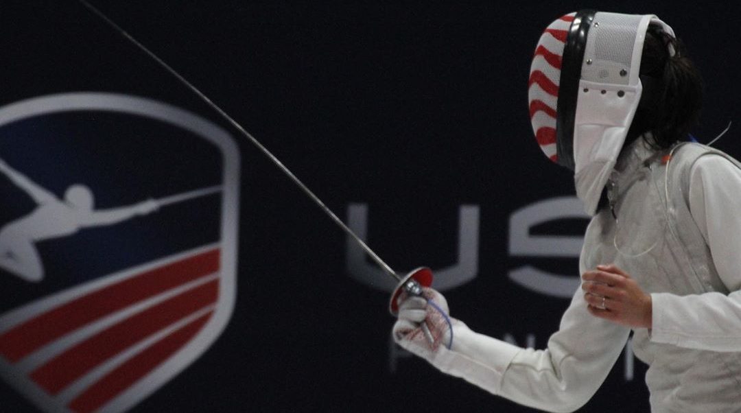
This looks to be a new logo for US Fencing since Rail Station would have had access to the current US Fencing logo as seen on www.usfencing.org today.

United States Fencing Logo
The current USA Fencing logo

The current logo had come under fire in the past because it featured a sabre fencer executing a fleche attack – an action that has been illegal for several years.

The existing logo is a refresh of the older two toned USFA logo, shown below in the print red/white version as well as the yellow/blue patch used in the 80s.

Update 7/11/10: At the US Fencing board of directors meeting, the logo was introduced as the new logo of USA Fencing.  The process will be to have the style guide for the logo out this month with the branding pushed into American Fencing Magazine in the fall edition and apparel available at the 1st NAC of the season.

The reasons for moving towards a new logo were a need to have a logo that could be customized based on the event (Junior Olympics, Nationals, etc) and team representation.  There was also a desire to move in lockstep with the USOCs new branding efforts.

According to the board presentation, the logo design went through a rigorous review process within the organization.

Cronan, the advertising agency that had been hired (and since fired) to assist in US Fencing’s rebranding efforts, did not create the logo design.

Take a look at the logos below and leave a comment to let us know what you think of the new one.

Logo before the name change to USA Fencing

Old USFA Logo

USFA Logo Patch
USFA Logo Patch

Share:

122 Comments

  • jspierre, July 11, 2010 @ 10:04 pm

    Horrid.

    The old one is so distinctive, dynamic and assertive.

    What did they pay to lay this egg?

  • jspierre, July 11, 2010 @ 6:04 pm

    Horrid.

    The old one is so distinctive, dynamic and assertive.

    What did they pay to lay this egg?

  • QuietJo, July 11, 2010 @ 10:48 pm

    Lack luster.

    How much time and money did this take? The USFA needs so much more than a new logo.

  • Matthew Koogler, July 11, 2010 @ 10:48 pm

    wow that is awful! That says nothing about fencing! I miss my sport so much :(

  • QuietJo, July 11, 2010 @ 6:48 pm

    Lack luster.

    How much time and money did this take? The USFA needs so much more than a new logo.

  • Matthew Koogler, July 11, 2010 @ 6:48 pm

    wow that is awful! That says nothing about fencing! I miss my sport so much :(

  • dkellner, July 11, 2010 @ 11:12 pm

    That logo is embarrassing, especially compared to the “old” one. The new one lacks the dynamic quality that makes fencing a great sport or the sense of patriotism you feel representing your country or competing on a national level.

    A logo should be able to instantly communicate what a product, service, or organization is about. The “old” logo may have depicted an out-of-date action, but people outside the sport don’t know that. What it did do was help show how exciting the sport is. Unfortunately, to me, this new logo says, “Boring.”

    I’m sorry if this is harsh, but companies usually put a lot of time and effort into a re-branding and this looks like a cheap, rush job.

  • dkellner, July 11, 2010 @ 7:12 pm

    That logo is embarrassing, especially compared to the “old” one. The new one lacks the dynamic quality that makes fencing a great sport or the sense of patriotism you feel representing your country or competing on a national level.

    A logo should be able to instantly communicate what a product, service, or organization is about. The “old” logo may have depicted an out-of-date action, but people outside the sport don’t know that. What it did do was help show how exciting the sport is. Unfortunately, to me, this new logo says, “Boring.”

    I’m sorry if this is harsh, but companies usually put a lot of time and effort into a re-branding and this looks like a cheap, rush job.

  • beloit fencer, July 11, 2010 @ 11:24 pm

    I hope they didn’t spend any of the funds earmarked to pay refs to develop this.

  • beloit fencer, July 11, 2010 @ 7:24 pm

    I hope they didn’t spend any of the funds earmarked to pay refs to develop this.

  • tinyfencer, July 11, 2010 @ 11:33 pm

    If the guy being a saber fencer is such a problem then just change the weapon to a foil or an epee. Please don’t change to the new logo, it looks like a fifth grader drew it.

  • tinyfencer, July 11, 2010 @ 7:33 pm

    If the guy being a saber fencer is such a problem then just change the weapon to a foil or an epee. Please don’t change to the new logo, it looks like a fifth grader drew it.

  • EldRick, July 12, 2010 @ 12:15 am

    The three older ones look more like Superman than fencing. The new one is bland, and has little association with the USA. It’s not well balanced on colors and is a really weak design. I’d give the fifth grader a C-.

    My personal pick would be the current one: Stars and Stripes. Change the grip from Sabre, and leave it alone otherwise.

    Doesn’t the USFA have better things to do with their time and energy?

  • EldRick, July 11, 2010 @ 8:15 pm

    The three older ones look more like Superman than fencing. The new one is bland, and has little association with the USA. It’s not well balanced on colors and is a really weak design. I’d give the fifth grader a C-.

    My personal pick would be the current one: Stars and Stripes. Change the grip from Sabre, and leave it alone otherwise.

    Doesn’t the USFA have better things to do with their time and energy?

  • William, July 12, 2010 @ 12:17 am

    Boring.

    Changing to USA Fencing is fine, but the logo itself is

    Boring.

    ( I sense that a patch-maker/embroiderer was consulted and advised that a circular shape and fewer details would be cheaper to produce. )

  • William, July 11, 2010 @ 8:17 pm

    Boring.

    Changing to USA Fencing is fine, but the logo itself is

    Boring.

    ( I sense that a patch-maker/embroiderer was consulted and advised that a circular shape and fewer details would be cheaper to produce. )

  • Matthew Koogler, July 12, 2010 @ 12:22 am

    i have yet to see a positive comment. seems like an emergency to me!

  • Matthew Koogler, July 11, 2010 @ 8:22 pm

    i have yet to see a positive comment. seems like an emergency to me!

  • Ed Browning, July 12, 2010 @ 1:26 am

    I guess when you are the only show in town you can do whatever you want
    and charge more money for it

  • Ed Browning, July 11, 2010 @ 9:26 pm

    I guess when you are the only show in town you can do whatever you want
    and charge more money for it

  • capt. slo-mo, July 12, 2010 @ 2:23 am

    Where’s the rest of the logo? That’s just one of many layers, right?

    Right?

  • capt. slo-mo, July 11, 2010 @ 10:23 pm

    Where’s the rest of the logo? That’s just one of many layers, right?

    Right?

  • Meredith, July 12, 2010 @ 4:37 am

    Horrible. Dull, bland, weak design. I give it an F. You can’t even see what it is. If everyone has such a problem with a sabre fencer doing a fleche, change it to a foil fencer. Nobody cares what weapon it is. I’d never put a sticker that looked like that on my car, or wear that on my shirt. Downright embarrassing and amateur.

  • Meredith, July 12, 2010 @ 12:37 am

    Horrible. Dull, bland, weak design. I give it an F. You can’t even see what it is. If everyone has such a problem with a sabre fencer doing a fleche, change it to a foil fencer. Nobody cares what weapon it is. I’d never put a sticker that looked like that on my car, or wear that on my shirt. Downright embarrassing and amateur.

  • flechewounds, July 12, 2010 @ 5:06 am

    meh….

    neither distinctive nor interesting…

  • flechewounds, July 12, 2010 @ 1:06 am

    meh….

    neither distinctive nor interesting…

  • big daddy, July 12, 2010 @ 12:16 pm

    Just change the weapon if you must. Better stilll keep th elogo and replace the UFSA with USA Fencing. The new logo looks so nutered.

  • big daddy, July 12, 2010 @ 8:16 am

    Just change the weapon if you must. Better stilll keep th elogo and replace the UFSA with USA Fencing. The new logo looks so nutered.

  • Gerhard, July 12, 2010 @ 12:58 pm

    Ugh…serious? I’d rather have the fleching sabre fencer. If people are pitching a stink about it, just photoshop the sabre to a foil.

  • Gerhard, July 12, 2010 @ 12:58 pm

    Sniff, sniff…Craig, I smell a logo contest coming up.

  • Gerhard, July 12, 2010 @ 8:58 am

    Ugh…serious? I’d rather have the fleching sabre fencer. If people are pitching a stink about it, just photoshop the sabre to a foil.

  • Gerhard, July 12, 2010 @ 8:58 am

    Sniff, sniff…Craig, I smell a logo contest coming up.

  • Craig Harkins, July 12, 2010 @ 1:33 pm

    Updated the post to reflect what we heard at the US Fencing Board of Directors meeting last night.

    From what I understand this was a group approved logo – not a single person decision. (Hence, a logo by committee.)

  • Craig Harkins, July 12, 2010 @ 9:33 am

    Updated the post to reflect what we heard at the US Fencing Board of Directors meeting last night.

    From what I understand this was a group approved logo – not a single person decision. (Hence, a logo by committee.)

  • Meredith, July 12, 2010 @ 2:19 pm

    There should NOT be a contest. Hire a designer. I can recommend several. A contest is just as bad as design by committee.

  • Meredith, July 12, 2010 @ 10:19 am

    There should NOT be a contest. Hire a designer. I can recommend several. A contest is just as bad as design by committee.

  • Foibles, July 12, 2010 @ 4:21 pm

    A bad design and a bad Idea.
    ~ The attempt at expressive line quality will not reproduce on a patch.
    ~ The design looks like someone’s favorite cousin designed it for them on the cheap.
    ~ The cost of changing logos is exorbitant.

    Re-printing of forms, letterheads, banners, signage, and business cards is costly. I suggest this is not the time to make such a change.

    Also, I expect they failed to consider the marketing materials of all of the American fencing clubs out there that will need to be (but won’t be) re-printed as well.

    This is an untimely step in the wrong direction.

  • Foibles, July 12, 2010 @ 12:21 pm

    A bad design and a bad Idea.
    ~ The attempt at expressive line quality will not reproduce on a patch.
    ~ The design looks like someone’s favorite cousin designed it for them on the cheap.
    ~ The cost of changing logos is exorbitant.

    Re-printing of forms, letterheads, banners, signage, and business cards is costly. I suggest this is not the time to make such a change.

    Also, I expect they failed to consider the marketing materials of all of the American fencing clubs out there that will need to be (but won’t be) re-printed as well.

    This is an untimely step in the wrong direction.

  • Sarah Frazer, July 12, 2010 @ 8:08 pm

    I agree with everyone else. The proposed logo is too bland. It doesn’t grab your attention at all. Stick with the one we have now and change the sabre to a foil or epee if it is a problem.

  • Sarah Frazer, July 12, 2010 @ 4:08 pm

    I agree with everyone else. The proposed logo is too bland. It doesn’t grab your attention at all. Stick with the one we have now and change the sabre to a foil or epee if it is a problem.

  • Dan Bell, July 12, 2010 @ 11:55 pm

    This is a late April Fools Joke right? If not is there any way to stop this from being implemented? Terrible on many counts not least of which is the fugly appearance. I sincerely hope not a penny of membership funds was spent on this utter piece of crap. We are constantly told of how short of funds the organization is, hell if we cannot even pay decent refs for the NACs why are we messing with the added costs of changing logos? Even if the new logo was awesome, now would hardly seem like the time to spend any of our precious funds on such a project. Who sat on the committee that approved this?

  • Dan Bell, July 12, 2010 @ 7:55 pm

    This is a late April Fools Joke right? If not is there any way to stop this from being implemented? Terrible on many counts not least of which is the fugly appearance. I sincerely hope not a penny of membership funds was spent on this utter piece of crap. We are constantly told of how short of funds the organization is, hell if we cannot even pay decent refs for the NACs why are we messing with the added costs of changing logos? Even if the new logo was awesome, now would hardly seem like the time to spend any of our precious funds on such a project. Who sat on the committee that approved this?

  • Slava, July 13, 2010 @ 2:29 am

    Not sure if I should be laughing or crying. Current logo is 100x better then the one THEY’ve desided to replace it with. I believe, that if you really want, you can integrate current logo design into a frame/s that would present USFA (mktg) with options for customizing based on the event. PS. I understand that it’s a stretch, but the point that could be argued, is that the saber fencer in the logo, simply excecuting a flunge and not a fleche, as crossover hasn’t occured ; )

  • Slava, July 12, 2010 @ 10:29 pm

    Not sure if I should be laughing or crying. Current logo is 100x better then the one THEY’ve desided to replace it with. I believe, that if you really want, you can integrate current logo design into a frame/s that would present USFA (mktg) with options for customizing based on the event. PS. I understand that it’s a stretch, but the point that could be argued, is that the saber fencer in the logo, simply excecuting a flunge and not a fleche, as crossover hasn’t occured ; )

  • IndianSpicedRice, July 13, 2010 @ 7:34 pm

    Congratulations USFA, you have simutaneously made me want to kill myself and hate fencing…

  • IndianSpicedRice, July 13, 2010 @ 3:34 pm

    Congratulations USFA, you have simutaneously made me want to kill myself and hate fencing…

  • snaffles, July 13, 2010 @ 8:21 pm

    aren’t there more important things for the USFA to be worrying about?

  • snaffles, July 13, 2010 @ 4:21 pm

    aren’t there more important things for the USFA to be worrying about?

  • GMurray, July 14, 2010 @ 4:12 am

    You have got to be kidding. The new logo stinks. It is poorly designed and is an embarassment to all fencers. If this was a committee decision, then the committee needs to be impeached. Please don’t waste our money on this abomination. I agree with just changing the sabre to a foil.

  • GMurray, July 14, 2010 @ 12:12 am

    You have got to be kidding. The new logo stinks. It is poorly designed and is an embarassment to all fencers. If this was a committee decision, then the committee needs to be impeached. Please don’t waste our money on this abomination. I agree with just changing the sabre to a foil.

  • Applesauce and Foils, July 14, 2010 @ 4:40 am

    Totally ugly. I will not put this on any of our stuff- cars, t-shirts, banners, flyers, NOTHING voluntarily. XP

  • Applesauce and Foils, July 14, 2010 @ 12:40 am

    Totally ugly. I will not put this on any of our stuff- cars, t-shirts, banners, flyers, NOTHING voluntarily. XP

  • SupahG, July 14, 2010 @ 9:06 pm

    Are you serious?? Did you have your six year old kid design something in Paint? Its a disgrace! Honestly the people that made this decision should be fired and sent to some state office to stare out the window all day. Its awful!!! Why change a good thing?? The original was completely fine, why change a good thing? Just change it back…or hire a designer older than six to work for you. AND..what kind of designer submits horrible designs like this to your client?? Don’t even continue…end it now…seriously you are no good. You had to hear it from someone. You are absolutely the worst designer alive.

  • SupahG, July 14, 2010 @ 5:06 pm

    Are you serious?? Did you have your six year old kid design something in Paint? Its a disgrace! Honestly the people that made this decision should be fired and sent to some state office to stare out the window all day. Its awful!!! Why change a good thing?? The original was completely fine, why change a good thing? Just change it back…or hire a designer older than six to work for you. AND..what kind of designer submits horrible designs like this to your client?? Don’t even continue…end it now…seriously you are no good. You had to hear it from someone. You are absolutely the worst designer alive.

  • Lacey, July 14, 2010 @ 10:05 pm

    If USFA was trying to look modern, profession, and improve on the previous logo, they failed. This new logo looks dated and very high-school-esque. If you wanted something professional and decent, but cheap, they should have approached student designers at any of many colleges that take on projects such as this or even opened it up to member to submit ideas.

  • Lacey, July 14, 2010 @ 6:05 pm

    If USFA was trying to look modern, profession, and improve on the previous logo, they failed. This new logo looks dated and very high-school-esque. If you wanted something professional and decent, but cheap, they should have approached student designers at any of many colleges that take on projects such as this or even opened it up to member to submit ideas.

  • SaberFencer, July 15, 2010 @ 5:00 pm

    It is TERRIBLE. It’s bland and ugly. The old one was great. Just change the weapon if it matters that much. The fleche looks exciting and the flag within the “U” looks patriotic and cool. The old one looks thought over and modern. The new one looks cheap and old fashioned.

  • SaberFencer, July 15, 2010 @ 1:00 pm

    It is TERRIBLE. It’s bland and ugly. The old one was great. Just change the weapon if it matters that much. The fleche looks exciting and the flag within the “U” looks patriotic and cool. The old one looks thought over and modern. The new one looks cheap and old fashioned.

  • Matt, July 16, 2010 @ 6:21 pm

    It’s a horrible logo in every way. Boring, bland, doesn’t reflect the dynamic and exciting nature of the sport. I’m glad they list the three weapons in case we forget what they are.

    I really hope they didn’t waste any money on this, but I’m sure they did. Why not have a logo contest? Give away ten memberships to the best entries, and a lifetime membership to the winner? That’s FREE and would have produced a dozen better entries.

  • Matt, July 16, 2010 @ 2:21 pm

    It’s a horrible logo in every way. Boring, bland, doesn’t reflect the dynamic and exciting nature of the sport. I’m glad they list the three weapons in case we forget what they are.

    I really hope they didn’t waste any money on this, but I’m sure they did. Why not have a logo contest? Give away ten memberships to the best entries, and a lifetime membership to the winner? That’s FREE and would have produced a dozen better entries.

  • Metalhead, July 16, 2010 @ 6:24 pm

    Boring!

  • Metalhead, July 16, 2010 @ 2:24 pm

    Boring!

  • archer1960, July 16, 2010 @ 6:27 pm

    I like the new fencer, but the old lettering and flag; so why not just change the fencer on the old one?

  • archer1960, July 16, 2010 @ 2:27 pm

    I like the new fencer, but the old lettering and flag; so why not just change the fencer on the old one?

  • ThatJeff, July 16, 2010 @ 2:29 pm

    Horrible. If the only complaint about the older logo was that it was a sabrist fleching, then do like everyone else has suggested and redo the old logo. Of course, I was greatly annoyed when the old blue and yellow logo was replaced by the “Superman” logo.

    But yeah, who in the world thought the new logo was an improvement? I suspect someone’s cousin (who’s a graphic designer) needed a job.

  • ThatJeff, July 16, 2010 @ 6:29 pm

    Horrible. If the only complaint about the older logo was that it was a sabrist fleching, then do like everyone else has suggested and redo the old logo. Of course, I was greatly annoyed when the old blue and yellow logo was replaced by the “Superman” logo.

    But yeah, who in the world thought the new logo was an improvement? I suspect someone’s cousin (who’s a graphic designer) needed a job.

  • rudy volkmann, July 16, 2010 @ 7:02 pm

    Rumor has it that they spent $25,000 total for this cluster **** (going through two vendors to do so). The USFA has an awful lot of talented people amongst its members — why not hold a contest offering the top three juried designs a free three-year membership and leave it to a full membership vote to decide the final logo (with a life-time membership going to the winning designer)?

  • rudy volkmann, July 16, 2010 @ 3:02 pm

    Rumor has it that they spent $25,000 total for this cluster **** (going through two vendors to do so). The USFA has an awful lot of talented people amongst its members — why not hold a contest offering the top three juried designs a free three-year membership and leave it to a full membership vote to decide the final logo (with a life-time membership going to the winning designer)?

  • AnotherJeff, July 16, 2010 @ 7:51 pm

    “I suspect someone’s cousin (who’s a *mediocre* graphic designer) needed a job.”

    FTFY

  • AnotherJeff, July 16, 2010 @ 3:51 pm

    “I suspect someone’s cousin (who’s a *mediocre* graphic designer) needed a job.”

    FTFY

  • DMS, July 16, 2010 @ 8:19 pm

    If this logo is supposed to reflect the new USFA, oops, I mean the new USA Fencing, then we all are in for a disappointing future!

  • DMS, July 16, 2010 @ 4:19 pm

    If this logo is supposed to reflect the new USFA, oops, I mean the new USA Fencing, then we all are in for a disappointing future!

  • Mark, July 16, 2010 @ 8:32 pm

    I can tell two things for certain about the USFA by looking at this new logo.

    #1 The USFA is poor and needs your help:
    This new logo screams “We’re so poor we had our secretary design our logo with free software! And they had the time to do it because nobody ever calls us!” Seriously I see this logo and imagine a black felt sign at the end of a dim hallway with white plastic letters on it spelling “USFA This Way” and the A is actually an upside down V. Don’t we pay these people?

    #2 The USFA thinks you’re an idiot:
    Just about every profession I can think of has a fencer in it. Which would include professional designers, directors, marketers, and brand professionals. And while the USFA may itself be run idiots, they should be reminded that their consituency is largely not. It doesn’t take a pro to realize what an unmitigated disaster this type of redesign is, but for a designer the word embarassing doesn’t cut it. The USFA however seems to think you will buy anything.

    So the USFA thinks the logo is great, and I can see why. The logo itself tells me the story. They are very poor, and they think you’re an idiot. Nice branding.

  • Mark, July 16, 2010 @ 4:32 pm

    I can tell two things for certain about the USFA by looking at this new logo.

    #1 The USFA is poor and needs your help:
    This new logo screams “We’re so poor we had our secretary design our logo with free software! And they had the time to do it because nobody ever calls us!” Seriously I see this logo and imagine a black felt sign at the end of a dim hallway with white plastic letters on it spelling “USFA This Way” and the A is actually an upside down V. Don’t we pay these people?

    #2 The USFA thinks you’re an idiot:
    Just about every profession I can think of has a fencer in it. Which would include professional designers, directors, marketers, and brand professionals. And while the USFA may itself be run idiots, they should be reminded that their consituency is largely not. It doesn’t take a pro to realize what an unmitigated disaster this type of redesign is, but for a designer the word embarassing doesn’t cut it. The USFA however seems to think you will buy anything.

    So the USFA thinks the logo is great, and I can see why. The logo itself tells me the story. They are very poor, and they think you’re an idiot. Nice branding.

  • Pam Giannatsis, July 16, 2010 @ 8:40 pm

    I agree with Meredith. Pls hire a professional logo designer who knows something about branding and marketing. For a long time now I have been thinking that the image on the decal I proudly affixed to my car is not visible enough to communicate what my sport is. Look at renowned illustrator Michael Schwab’s logos — he’s probably pricey, but look what he’s done with cycling, rowing and polo. Pls do the job right. I would have no reason to put the new logo anywhere.

  • Pam Giannatsis, July 16, 2010 @ 4:40 pm

    I agree with Meredith. Pls hire a professional logo designer who knows something about branding and marketing. For a long time now I have been thinking that the image on the decal I proudly affixed to my car is not visible enough to communicate what my sport is. Look at renowned illustrator Michael Schwab’s logos — he’s probably pricey, but look what he’s done with cycling, rowing and polo. Pls do the job right. I would have no reason to put the new logo anywhere.

  • NGrajales, July 16, 2010 @ 9:22 pm

    Sorry guys – from graphic arts point of view the logo lack impact, the reverse icon is too thinly stroked against the heavy blue background and the text is dated, not the mention the letter P in epee is crashing the outer rule. I feel the older logo was visually more vivid, and bolder in effect regardless of the saber fleche art. The two red stars are almost an afterthought. Why not work them into the background a bit larger to help the contrast for the fencer? Still I do admit, as an org, are do for a visual overhaul, but I think this version falls short.

  • NGrajales, July 16, 2010 @ 5:22 pm

    Sorry guys – from graphic arts point of view the logo lack impact, the reverse icon is too thinly stroked against the heavy blue background and the text is dated, not the mention the letter P in epee is crashing the outer rule. I feel the older logo was visually more vivid, and bolder in effect regardless of the saber fleche art. The two red stars are almost an afterthought. Why not work them into the background a bit larger to help the contrast for the fencer? Still I do admit, as an org, are do for a visual overhaul, but I think this version falls short.

  • brycemeister, July 16, 2010 @ 6:53 pm

    B O R I N G ….. where’s the imagination?

  • brycemeister, July 16, 2010 @ 10:53 pm

    B O R I N G ….. where’s the imagination?

  • brycemeister, July 16, 2010 @ 10:53 pm

    B O R I N G …. where’s the imagination?

  • brycemeister, July 16, 2010 @ 6:53 pm

    B O R I N G …. where’s the imagination?

  • Maj, July 16, 2010 @ 11:48 pm

    So much is lost with the new logo … The flag, the dynamic action of fencing, the pride of USA fencing clearly labeled. Do not like the new label at al!

  • Maj, July 16, 2010 @ 7:48 pm

    So much is lost with the new logo … The flag, the dynamic action of fencing, the pride of USA fencing clearly labeled. Do not like the new label at al!

  • Maestro Masters, July 17, 2010 @ 3:16 pm

    We may need a new logo and rebranding but make it a logo that says fencing to the public, not squiggle or I dropped my spagetti and it landed in a funny shape.

  • Maestro Masters, July 17, 2010 @ 11:16 am

    We may need a new logo and rebranding but make it a logo that says fencing to the public, not squiggle or I dropped my spagetti and it landed in a funny shape.

  • sabregirl, July 17, 2010 @ 3:23 pm

    The new logo is boring, and frankly? extremely ugly. I agree that I wouldn’t want it on any of my clothing, and I can’t imagine anyone else would either. Whoever is in this committee that chose it, perhaps you need to be going out and doing some polling outside of yourselves…

  • sabregirl, July 17, 2010 @ 11:23 am

    The new logo is boring, and frankly? extremely ugly. I agree that I wouldn’t want it on any of my clothing, and I can’t imagine anyone else would either. Whoever is in this committee that chose it, perhaps you need to be going out and doing some polling outside of yourselves…

  • leoncoeur, July 17, 2010 @ 7:56 pm

    It’s predictable, if a bit boring. The round shape is good for marketing though…will make good patches and keychains…

  • leoncoeur, July 17, 2010 @ 3:56 pm

    It’s predictable, if a bit boring. The round shape is good for marketing though…will make good patches and keychains…

  • TxFencingMom, July 17, 2010 @ 9:11 pm

    With the embarrassing debacle of USFA not being able to pay our referees and are in the hole financially,they roll out that travesty of brand identity.

    XKCD could have done a better job.
    Does anyone on the committee ever actually talk to the people who are paying membership dues…..you know, the fencers?

    I think USFA needs to disclose how much money was wasted. How many outstanding debts could have been paid?
    We will NOT be purchasing anything with that silly piece of nonsense on it.

    When I tried to log on to hangastar and got railstation with that logo(?) I seriously thought the site had been hacked by 4chan.

    TL;DR
    Committee is out of touch with reality and who they are suppose to represent.

    2012-The world will be laughing.

  • TxFencingMom, July 17, 2010 @ 5:11 pm

    With the embarrassing debacle of USFA not being able to pay our referees and are in the hole financially,they roll out that travesty of brand identity.

    XKCD could have done a better job.
    Does anyone on the committee ever actually talk to the people who are paying membership dues…..you know, the fencers?

    I think USFA needs to disclose how much money was wasted. How many outstanding debts could have been paid?
    We will NOT be purchasing anything with that silly piece of nonsense on it.

    When I tried to log on to hangastar and got railstation with that logo(?) I seriously thought the site had been hacked by 4chan.

    TL;DR
    Committee is out of touch with reality and who they are suppose to represent.

    2012-The world will be laughing.

  • fencer, July 18, 2010 @ 12:10 am

    it looks terrible, a 6th grader could make a better logo with crayons….

  • fencer, July 17, 2010 @ 8:10 pm

    it looks terrible, a 6th grader could make a better logo with crayons….

  • Michael Caisse, July 18, 2010 @ 4:37 am

    Absolutely horrible. I can see a blackmarket for shirts at NACs with the old logo. Where do I sign up to get a booth?

  • Michael Caisse, July 18, 2010 @ 12:37 am

    Absolutely horrible. I can see a blackmarket for shirts at NACs with the old logo. Where do I sign up to get a booth?

  • Fencerjavier, July 18, 2010 @ 1:39 pm

    The new logo is an embarrassment to all of us who love fencing, besides the amateurish design it just doesn’t convey the energy and beauty of fencing at all. I would volunteer to redesign the logo at pro-bono rates. I’ve done plenty of sports related brand design. See some of my work here: http://www.athcomm.com/index.html http://www.jrdg.com/event.html http://fenceissue.com/index.html

  • Fencerjavier, July 18, 2010 @ 9:39 am

    The new logo is an embarrassment to all of us who love fencing, besides the amateurish design it just doesn’t convey the energy and beauty of fencing at all. I would volunteer to redesign the logo at pro-bono rates. I’ve done plenty of sports related brand design. See some of my work here: http://www.athcomm.com/index.html http://www.jrdg.com/event.html http://fenceissue.com/index.html

  • Jason Seachrist, July 19, 2010 @ 12:56 am

    As an American fencer and military veteran, I am disgusted that the flag has been removed and our nation’s abbreviation has been minimized! The new logo is horrible and insulting. Are Americans actually still running the USFA?

  • Jason Seachrist, July 18, 2010 @ 8:56 pm

    As an American fencer and military veteran, I am disgusted that the flag has been removed and our nation’s abbreviation has been minimized! The new logo is horrible and insulting. Are Americans actually still running the USFA?

  • Dan Mulligan, July 20, 2010 @ 2:41 am

    imagine my astonishment:

    http://www.zazzle.com/jackson_fencing_club_black_tshirt-235694085642055943

    It looks like they asked a mentally deranged person to copy my logo …..

  • Dan Mulligan, July 19, 2010 @ 10:41 pm

    imagine my astonishment:

    http://www.zazzle.com/jackson_fencing_club_black_tshirt-235694085642055943

    It looks like they asked a mentally deranged person to copy my logo …..

  • Carlos, July 20, 2010 @ 4:12 am

    The idea is too obvious and lacks expression.
    It’s more in the way of becoming a (bad and poor) new logo for U.S.A. Volleyball.
    I hope you americans will not let that happen.
    Good luck!

  • Carlos, July 20, 2010 @ 12:12 am

    The idea is too obvious and lacks expression.
    It’s more in the way of becoming a (bad and poor) new logo for U.S.A. Volleyball.
    I hope you americans will not let that happen.
    Good luck!

  • randall, July 20, 2010 @ 5:16 pm

    Please do not use this new logo. I see it as a retreat, right off the strip. There are several enlightening posts by persons with obvious skills in the graphic arts discipline. I’m smarter for having read them, and I agree with them all. In my opinion, the new logo is too simple and too drab. Even as a fencer, it does not engage me; I’m sure non-fencers won’t give it a second look, in spite of the included weapon names.

  • randall, July 20, 2010 @ 1:16 pm

    Please do not use this new logo. I see it as a retreat, right off the strip. There are several enlightening posts by persons with obvious skills in the graphic arts discipline. I’m smarter for having read them, and I agree with them all. In my opinion, the new logo is too simple and too drab. Even as a fencer, it does not engage me; I’m sure non-fencers won’t give it a second look, in spite of the included weapon names.

  • allen Tarver, July 21, 2010 @ 12:43 am

    I think it was a mistake to change to the less distinctive logo. I thought we graduated from stick figures.

  • allen Tarver, July 20, 2010 @ 8:43 pm

    I think it was a mistake to change to the less distinctive logo. I thought we graduated from stick figures.

  • sabrist, July 21, 2010 @ 3:16 pm

    How often has anyone wished that they had a USA Fencing keychain? This one is boring and has no appeal to the public, whereas the old one did. yeah, sure it was a sabrist fleching (flunging, no proof of a fleche) but it got the pubilcs eye. Can we do anything to get the old logo back? A petition or something?

  • sabrist, July 21, 2010 @ 11:16 am

    How often has anyone wished that they had a USA Fencing keychain? This one is boring and has no appeal to the public, whereas the old one did. yeah, sure it was a sabrist fleching (flunging, no proof of a fleche) but it got the pubilcs eye. Can we do anything to get the old logo back? A petition or something?

  • H. J., July 21, 2010 @ 9:03 pm

    The new logo is drab, boring, lacking energy and artistic flair.
    They have got to be kidding that they are going to change from the great exciting one
    to this sucky one. No flag? A lame stick fencer? Two red stars? And what is the font, Arial?
    That is a disgrace as a national logo.

  • H. J., July 21, 2010 @ 5:03 pm

    The new logo is drab, boring, lacking energy and artistic flair.
    They have got to be kidding that they are going to change from the great exciting one
    to this sucky one. No flag? A lame stick fencer? Two red stars? And what is the font, Arial?
    That is a disgrace as a national logo.

  • Keith, July 23, 2010 @ 7:44 pm

    My girlfriend was looking over my shoulder while I was looking at the new logo. Her exact words after I told her what it was the new USFA logo were “You can’t even tell what it is at two feet from the monitor!”

    If you’re looking to make the sport (and the logo), more visible, you’ve not done a terribly good job of it. I’m in agreement with everyone else — it’s a very boring design with too much white space (well, in this case ‘blue’). The lines of the figure do not show up well from any distance and there just seem to be any “excitement” in the new logo.

    Branded logos are supposed to express their product. In this case the new logo looks like it represents a non-creative bunch of people who don’t really know what they’re doing.

  • Keith, July 23, 2010 @ 3:44 pm

    My girlfriend was looking over my shoulder while I was looking at the new logo. Her exact words after I told her what it was the new USFA logo were “You can’t even tell what it is at two feet from the monitor!”

    If you’re looking to make the sport (and the logo), more visible, you’ve not done a terribly good job of it. I’m in agreement with everyone else — it’s a very boring design with too much white space (well, in this case ‘blue’). The lines of the figure do not show up well from any distance and there just seem to be any “excitement” in the new logo.

    Branded logos are supposed to express their product. In this case the new logo looks like it represents a non-creative bunch of people who don’t really know what they’re doing.

  • Andrew, August 13, 2010 @ 9:31 pm

    This logo is a travesty. I can’t believe money of any sort was paid for it. First year Art students with no knowledge of he sport could come up with something better.

  • Andrew, August 13, 2010 @ 5:31 pm

    This logo is a travesty. I can’t believe money of any sort was paid for it. First year Art students with no knowledge of he sport could come up with something better.

  • Bloix, August 16, 2010 @ 12:24 am

    Looks like the logo of some sub-sub-division of the Department of Commerce. It’s got no athletic feel at all.

  • Bloix, August 15, 2010 @ 8:24 pm

    Looks like the logo of some sub-sub-division of the Department of Commerce. It’s got no athletic feel at all.

  • Jonathan, August 24, 2010 @ 5:02 am

    As someone with 30 years of professional international branding experience…I am stunned.
    Stunned by how truly awful this unprofessional attempt at communication is. Who is sleeping with Whom?I could not set out to make a more flawed,ugly, and off-message mark. Never will this be on anything I own. Ick!

  • Jonathan, August 24, 2010 @ 1:02 am

    As someone with 30 years of professional international branding experience…I am stunned.
    Stunned by how truly awful this unprofessional attempt at communication is. Who is sleeping with Whom?I could not set out to make a more flawed,ugly, and off-message mark. Never will this be on anything I own. Ick!

  • Skimonkey, October 11, 2010 @ 7:36 pm

    It would have been nice if they’d spelled Sabre the traditional (dare I say, correct?) way in the new logo. Once again, the rest of the world will scoff at the US.

    The logo itself is just awful. It lacks any action, is non-distinctive, and is a step backwards.

  • Leslie, November 3, 2010 @ 11:02 am

    Good form, incorporating the body like that.
    However, the reason I came to the site was to find out the actual history of fencing, was it a practicing tool untill they graduated into the much heavier sword?
    [email protected]

Comments are closed.